Bose offers premium products that deserve premium packaging. I wanted to create a packaging system that was all cohesive with each other, yet let each individual product reflect its own personality when standing on its own.
The SoundLink Color is targeted at an audience that is concerned about getting the most sound for a lower price point. This speaker gets pretty loud and is great for hanging out in group settings. So the graphic on the packaging feels like a "blast" of sound. This reflects the energetic nature of this speaker and its audience.
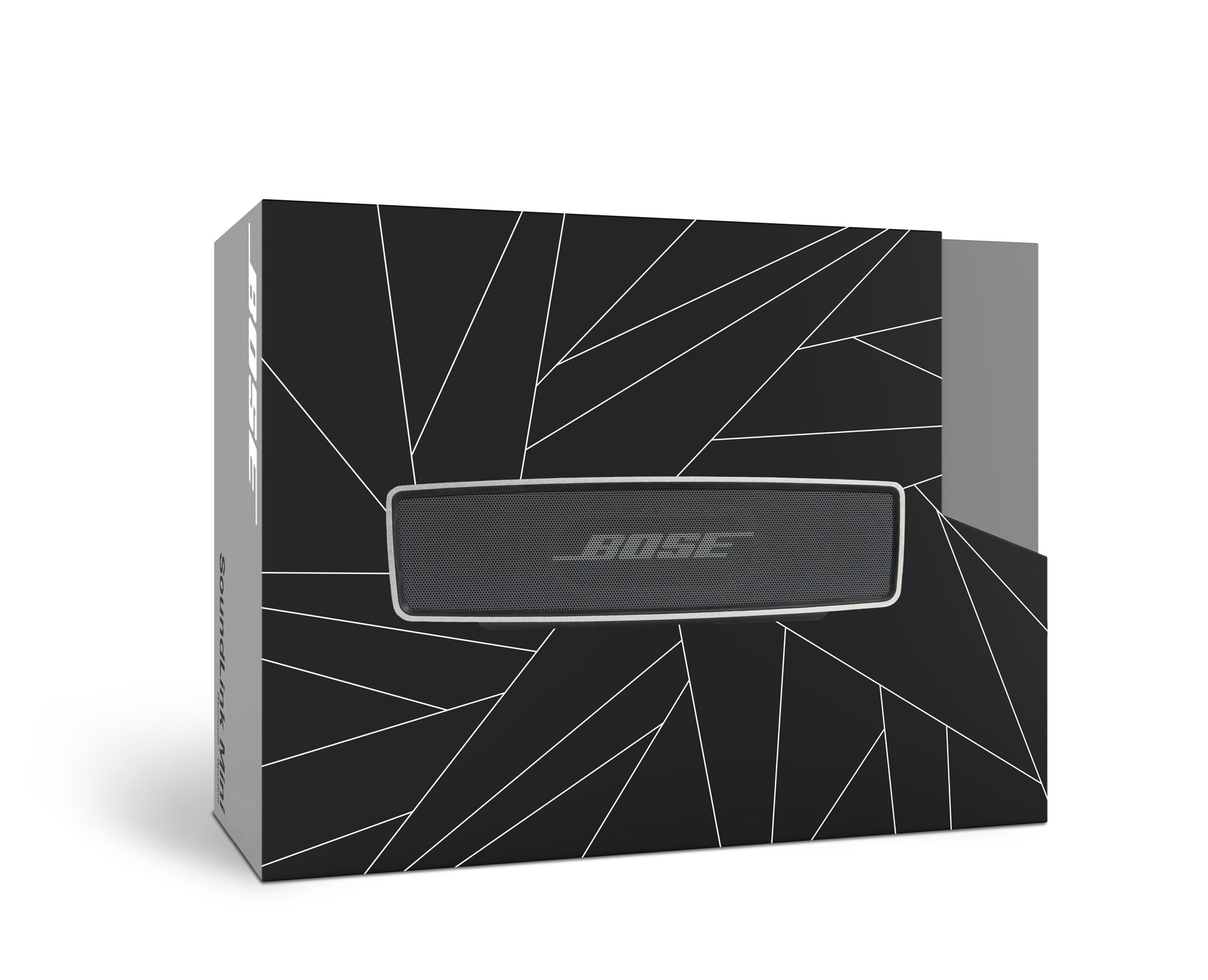
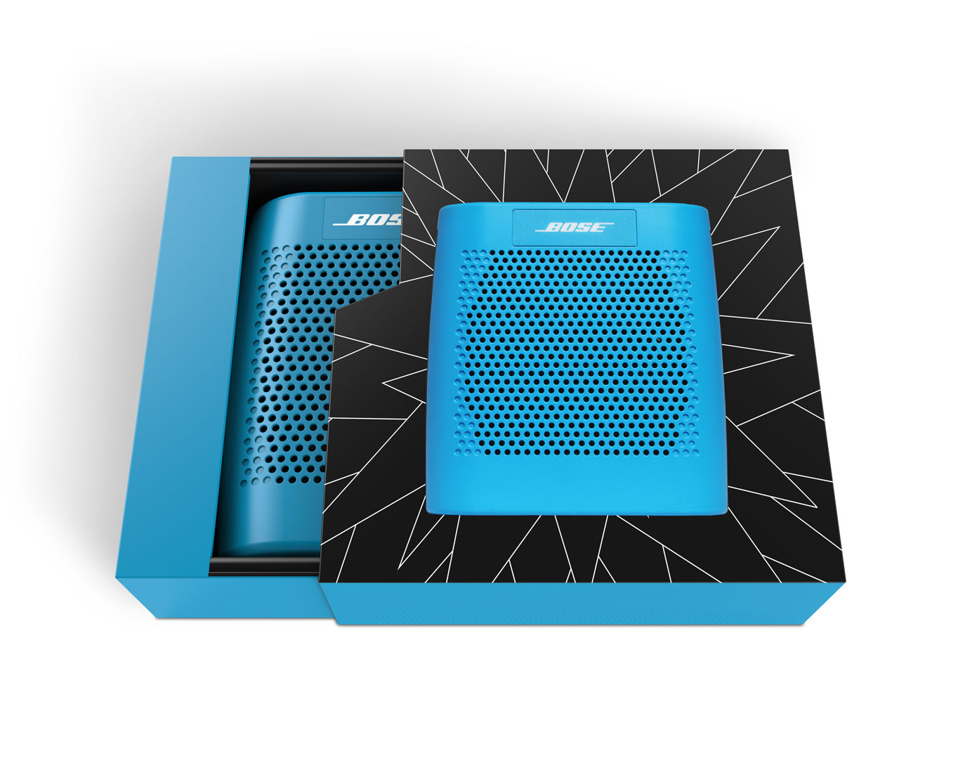
The Soundlink Mini is the more expensive mini speaker. While this speaker doesn't have quite as much volume as the Soundlink Color, the bass and dynamic range are better. The graphic reflects a more sophisticated form insinuating the sound nicely flowing around the room.
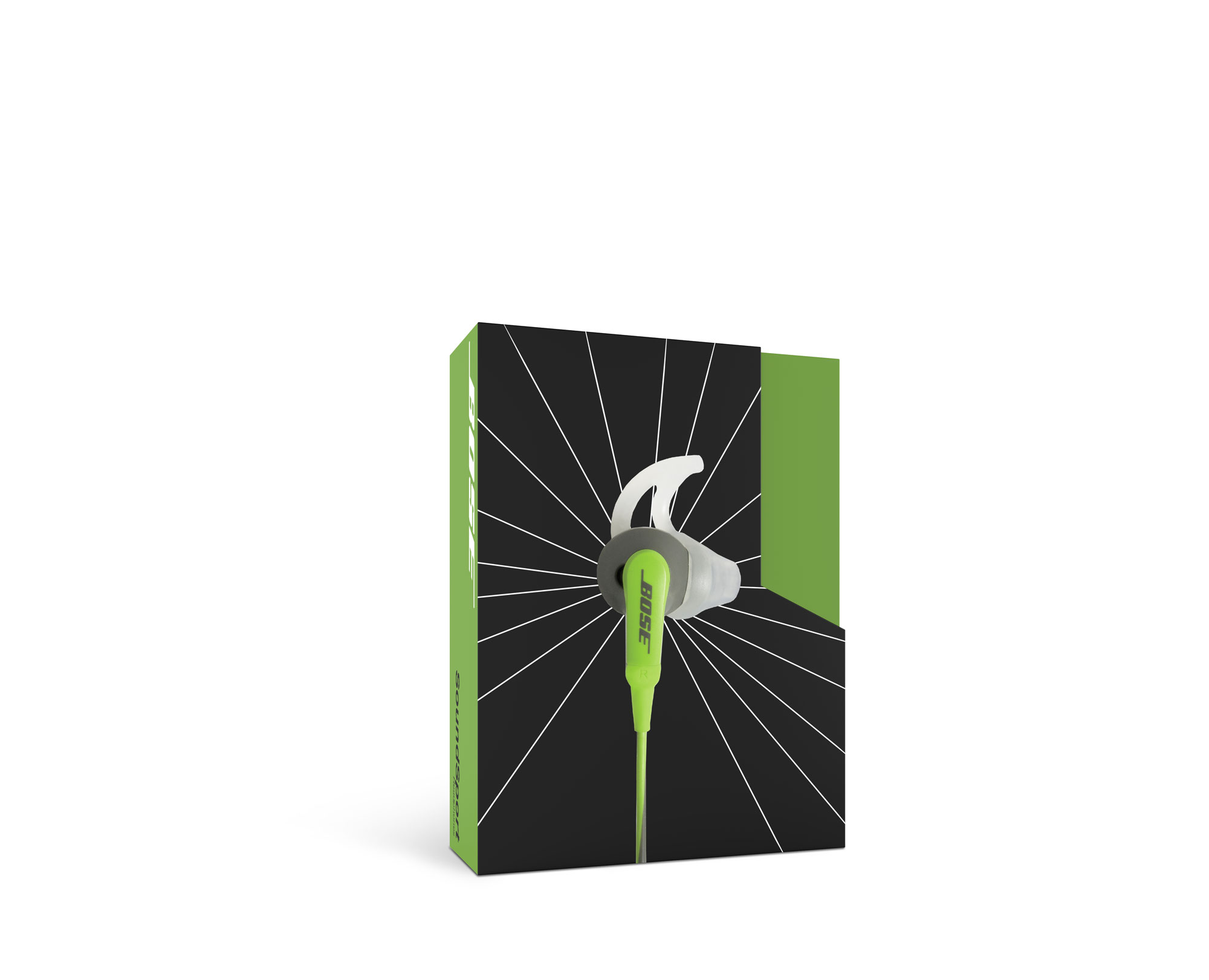
The SoundSport headphones are for the athletic audience. The graphic reflects a "burst" of sound to hint at that burst of energy you need to get through your workout.
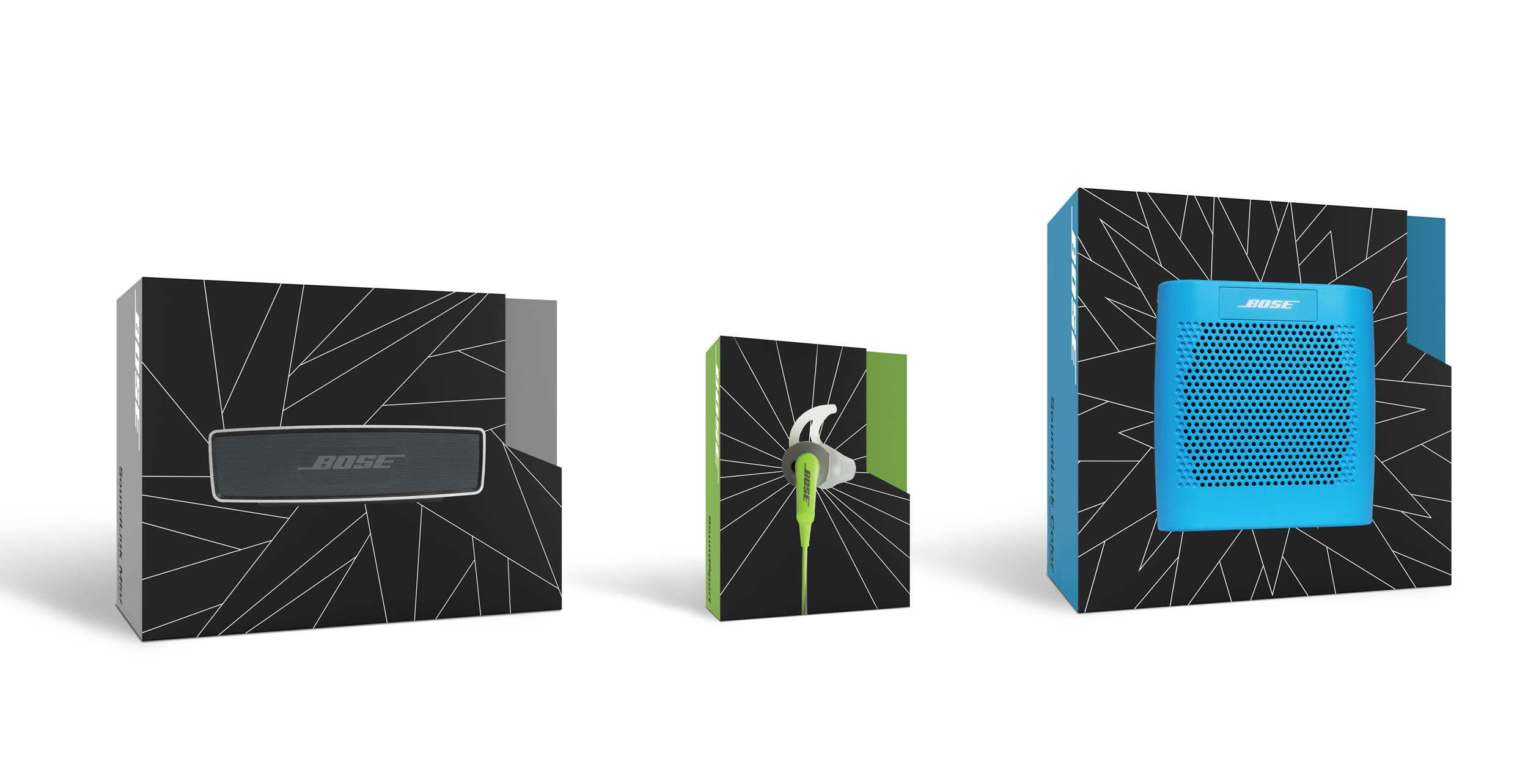
When displayed together, it's obvious that these packages belong in the same system. They are wrapped with printed graphics over a sturdily built box that slides out when pulled from the tab on the side to give the packaging a premium look and feel.
Work.

Ferrari of Atlanta
Event Branding | Videography

Video Gallery
Videography | Motion Graphics

Event Shoots
Videography | Photography

Cheribundi
Branding | Packaging | Animation | Videography

Turning Point Church
Website

ServeCo
Publication | Video | Trade Show Booth Design

Altruist
Bottle Design

Zoo-Oru
Logo & Icon System Design

Bose
Packaging Re-design

TACKLE
Branding | Packaging

At the Movies
Series Branding | Animation

Coleman
Conceptual App Design